
‘Dea Vivente’ dolls (from Italian: “living goddess”) represent genuine and healthy women living in harmony with themselves and the world, having a grown mature body with fluent and natural lines. Born for admiration and respect, they are full of dignity, honour and inner strength.
Sensitivity and sensuality coexist inseparably in them: softness, tenderness and delicacy from one side, from the other side – fire and passion. Their image can be natural and calm or bright and extravagant – everything is harmonious and euphonic in it.
By my work I tell not only about the nude body’s beauty, but also I try to show the body becoming shelter for a deep inner world with all its lurking corners of soul, mind and facets of feelings and emotions.
To reflect the main ideas of Dea Vivente I needed a logotype – elegant and refined, but also simple and clear at the same time.
I began working on the logo long ago, and little by little I was moving towards its perfect (to my mind) representation. I draw different sketches, there were many tries, observations and thoughts…

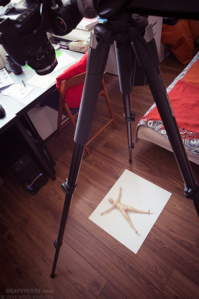
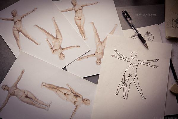
One of the ideas was to picture a doll’s figure in Vitruvian man’s pose from the Leonardo da Vinci’s famous drawing, as a symbol of harmony, well-formed proportions and the human body’s beauty. To link this idea to the brand, a woman’s figure in the logo should have repeated Dea Vivente dolls’ silhouette. To draw the body form I took many photos of the doll – Dea posed as a model for me. In the following photo she is lying in one of the poses, and then you can see a sketch drawn by hand from her silhouette:
Later I stepped away from direct reference to Vitruvian man, and the logo evolved in a new image of the “living goddess”. And today I proudly present it to you:
![]()
Two variants of the logo visually differentiate doll’s series: Dea Vivente woman in a long dress that makes her figure statuary and majestic is the main logo for porcelain dolls in unique characters. The nude goddess image is for the series of nude porcelain dolls (Dea Vivente Familia).
Circle represents wholeness, unity and infinity. Biological forms ‘entwining’ the circle hint at inner connection between human with nature.
For the logo I’ve chosen a subtle and serene tone of the colour between blue and violet. Both colours reflect the main essence of Dea Vivente in the best way possible: blue is a colour of peace and universal harmony, tuning to the sphere of high feelings; violet is a colour of reverie, inner concentration and melancholy, leading to inner extension and uniting body and spirit.
I’m content that Dea Vivente has a logo now, and I’m very happy that I’ve completely succeeded in reflecting the essence of my dolls in it. Stay tuned for a new doll’s pictures with it!